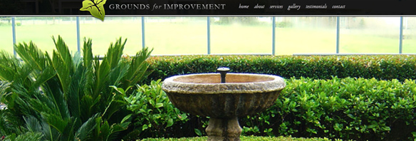
Grounds for Improvement is a landscaping company focusing on new designs or overhauling your existing garden – but this time it was their turn for a redesign!
Not only did they get a brand new logo and accompanying stationery, we’ve completely overhauled their website and brand. We started by creating a logo that better incorporates the type of work they do – stylish and modern – while keeping a familiar element in the form of the leaf icon. We’ve also updated the colour scheme, moving on from the more general browns and greens of gardening, to a classy black with minimal silver, gold and green highlights.
To make the website stand out from the pack, the whole background is taken over by large, colourful images of work that Grounds for Improvement have completed over the years. As it is a very visual business, we felt that a visual, image based website was the way to go – this is just one of the ways we can tailor a website to match your business, giving your customers the information that is most important to them – in this case, the amazing results that the Grounds for Improvement team can achieve.
Not only are the images great, but so is the copy. Copywriting is another service we offer here at Orion Creative, and one that can make a huge difference to your Google rank and general presence on the web. Not only is professionally written copy more compelling and more likely to leave a lasting impression on your clients, we can also use it to target specific keywords that are likely to be searched in relation to your business (eg. landscaping, residential design, etc) which increases your likelihood of being found online.
As always, don’t forget to check out the finished product and if you think your logo or website might be ready for an update, why not give us a call or pop in for a coffee and a chat?
