Until quite recently, websites were designed to be viewed on desktop computers.
With the explosion of visitors now coming online via mobile phones and tablets, as web designers and developers we’re taking a fresh look at what defines a good user experience.
Responsive web design is not a shrunken down replica of the full desktop version. If a site is just designed for desktops, everything becomes tiny on a phone. Navigation becomes very difficult to use with your fingers, and the mobile user becomes frustrated as they pinch and zoom to try to access the content, possibly even injuring themselves in the process. Sorry, you’ve probably just lost (and/or maimed) a customer.
Two-thirds of smartphone users say a mobile-friendly site makes them more likely to buy a company’s product or service, and 74% say they’re more likely to return to the site later.
– Study by Sterling Research and SmithGeiger 2012
What is responsive web design?
Responsive design is modifying the interface to suit screen size, not maintaining exactly the same site.
Web designers and developers can use a range of techniques to enable your website to adapt to whatever device it’s being viewed on. Responsive sites will automatically scale to different device widths: mainly desktop, tablet, and mobile, while still displaying the content in an easily viewable or usable form without having to manually adjust the appearance of the content into an easily digestible state.
How do websites look on different devices?
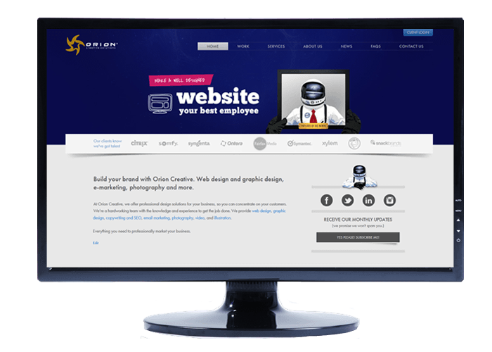
Below you can see a screen shot of how the home page of the Orion Creative website appears on a desktop computer:

Here’s how it looks on an iPad:

Some of the changes you will notice include:
• Services banners shrink and Flash files are replaced with static images.
• Client logo banner shrinks to show fewer clients.
• Sidebar moves under main content.
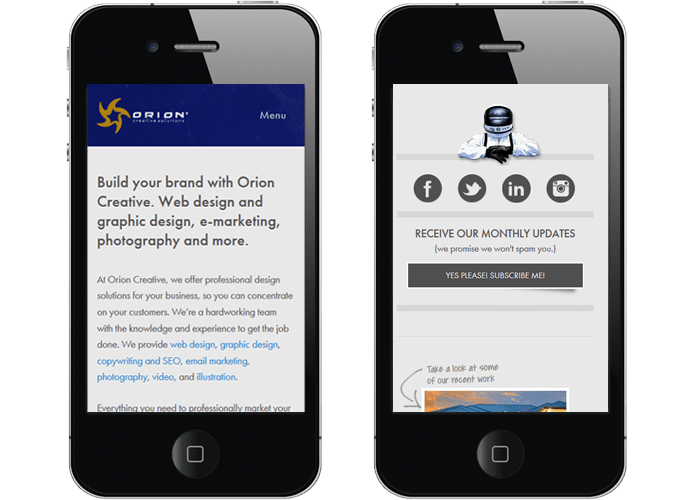
On an iPhone, the site looks like this:

You’ll notice that the changes include:
• Services banners removed completely.
• Client logo banner removed completely.
• Logo shrinks down and moves closer to naviation.
• Menu shrinks to a single button which opens up the full menu on tap.
• Content “stacks” under each other to suit vertical scrolling.
• Text resizes to fit screen nicely.
Is responsive web design important for my website?
Firstly, do you know which devices your customers are using to access your website?
It wouldn’t surprise you to discover that visits from mobile and tablets are on the increase, but these stats can vary from site to site.
Proportion of visits by mobile users depends on the type of business and the type of clients.
Some of our clients’ sites total website views by mobile users are as low as 10%, while for others, as much as 70% of their viewers are mobile.
How can I know which devices my website visitors are using?
If you are tracking your website traffic with Google Analytics or another website monitoring tool you can find out almost exactly how many are viewing on a mobile device. You can also compare the average level of engagement of a mobile visitor with a desktop one, to see whether the site works as well on a mobile device as it does on a PC. If your site is hosted with Orion Creative, we can check it for you.
Got any other questions on responsive web design? Let us know in the comments section below.