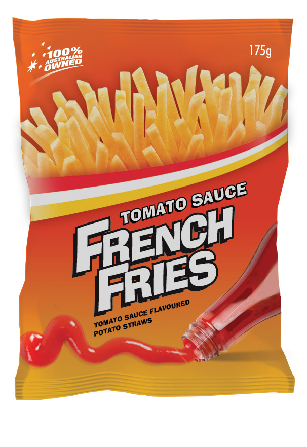
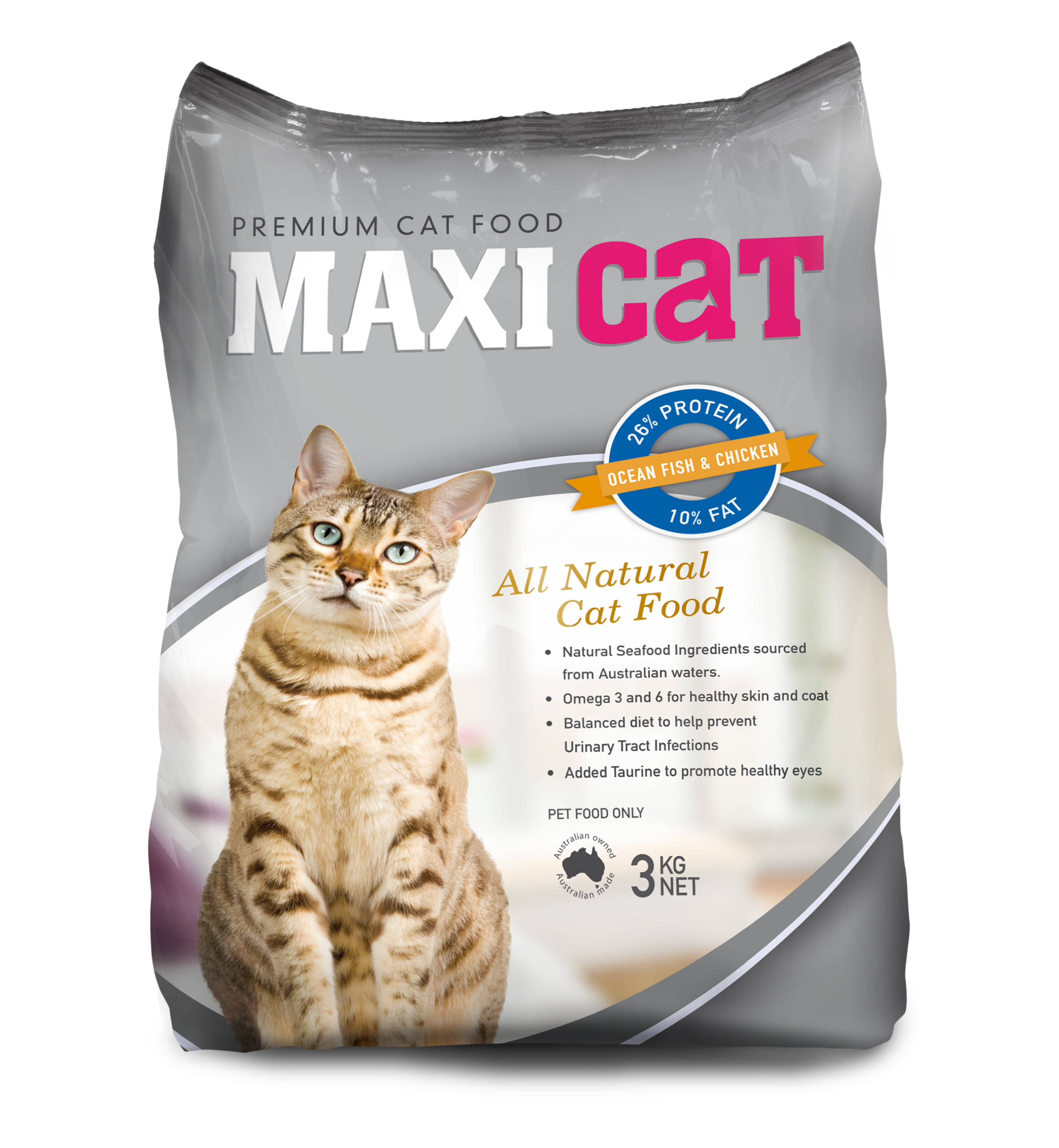
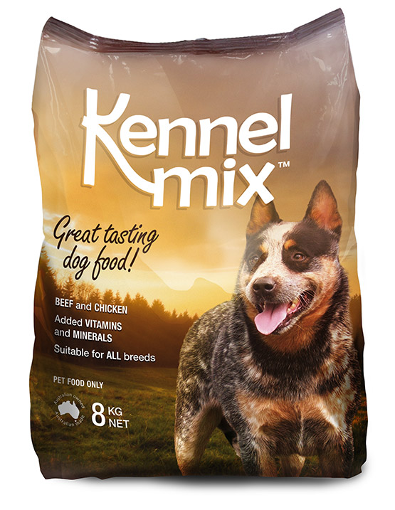
Unless you work in the food, beverage or manufacturing industries, you may not take much notice of the way products are packaged and presented on supermarket shelves.
Subconsciously though, as you reach for a product you will be registering things like colour, attractiveness of product images, and how easily you can see the information you need to know to decide on your purchase.
Is package design like regular ol’ graphic design?
Package design includes a lot of traditional graphic design elements, such as colour and typography. Package design has also developed its own design code as it has evolved to better serve the customers it seeks to attract.
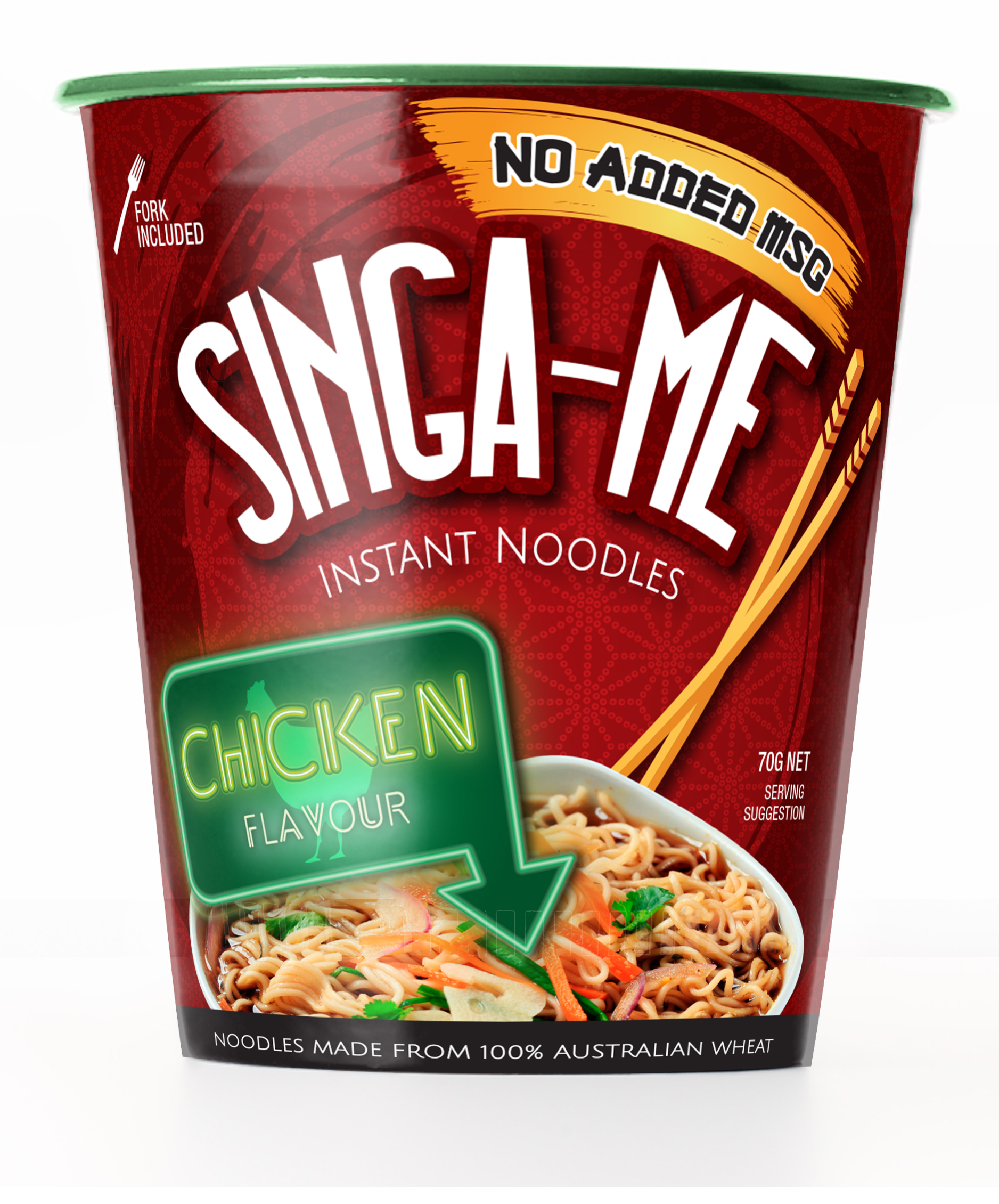
The colour green, for example, has now become synonymous with ‘chicken’ flavours, as package designers work creatively to overcome the challenges of conveying the appeal of a product through images and labels.
Other things designers take into consideration when creating packaging are technical:
- What are the exact specs for the cutting guide?
- How will it sit on the shelf?
- What products are likely to be around it – how can you ensure it stands out?
Although we often have designers working on packaging in the Orion offices, it’s a service that many of our clients don’t know we do. So let’s take a stroll through the process.
The concept
Once our client has briefed us on the look and feel they would like, as well as the package specs and what details need to be included on the pack, our designers get working on a concept for how the packaging could look.
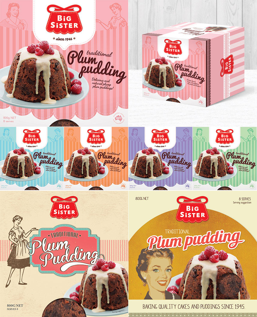
In this example, the brief we received for Big Sister was to honour the tradition of this iconic Australian brand, while appealing to the switched-on, contemporary customer amid a resurgence in appreciation of retro design.
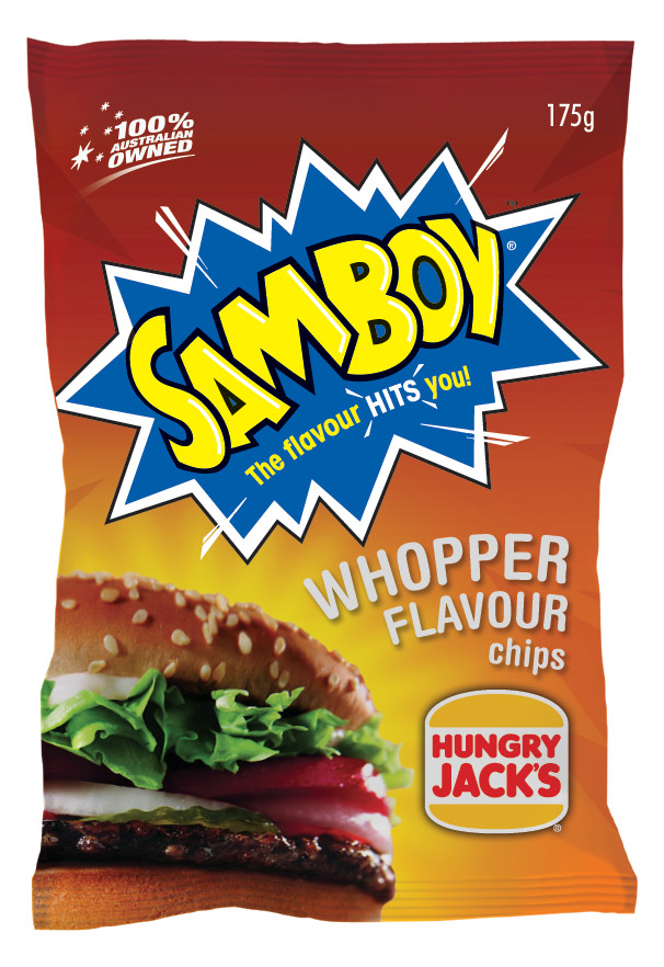
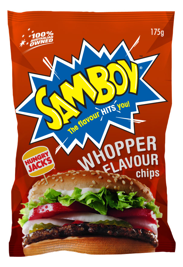
Snackfood’s cult classic brand Samboy Chips is another example – pictured here are two concepts created for Samboy’s limited-edition Whopper flavour chips, each with minor variation in colour gradation and placement of text and image elements.
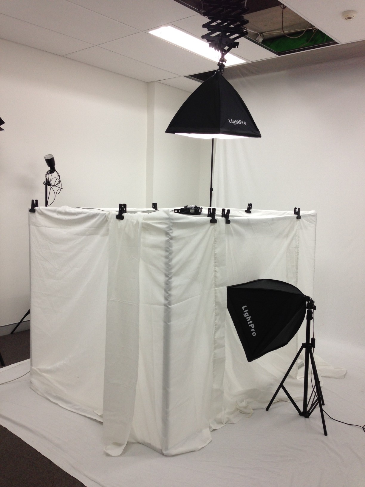
Product Photography
Getting an appealing shot of the product is a really important starting point has a big effect on the end package design.
Sometimes clients will have a set of images ready for us to use. If not, we can offer excellent results from our in-house photography studio.
We make sure we use the best lighting to achieve the optimum effect.
Designing a product range
Different products in a range need to be significantly different while keeping within the brand. When this is not done correctly, you end up picking up the ‘Lite’ version when you wanted full fat for example!
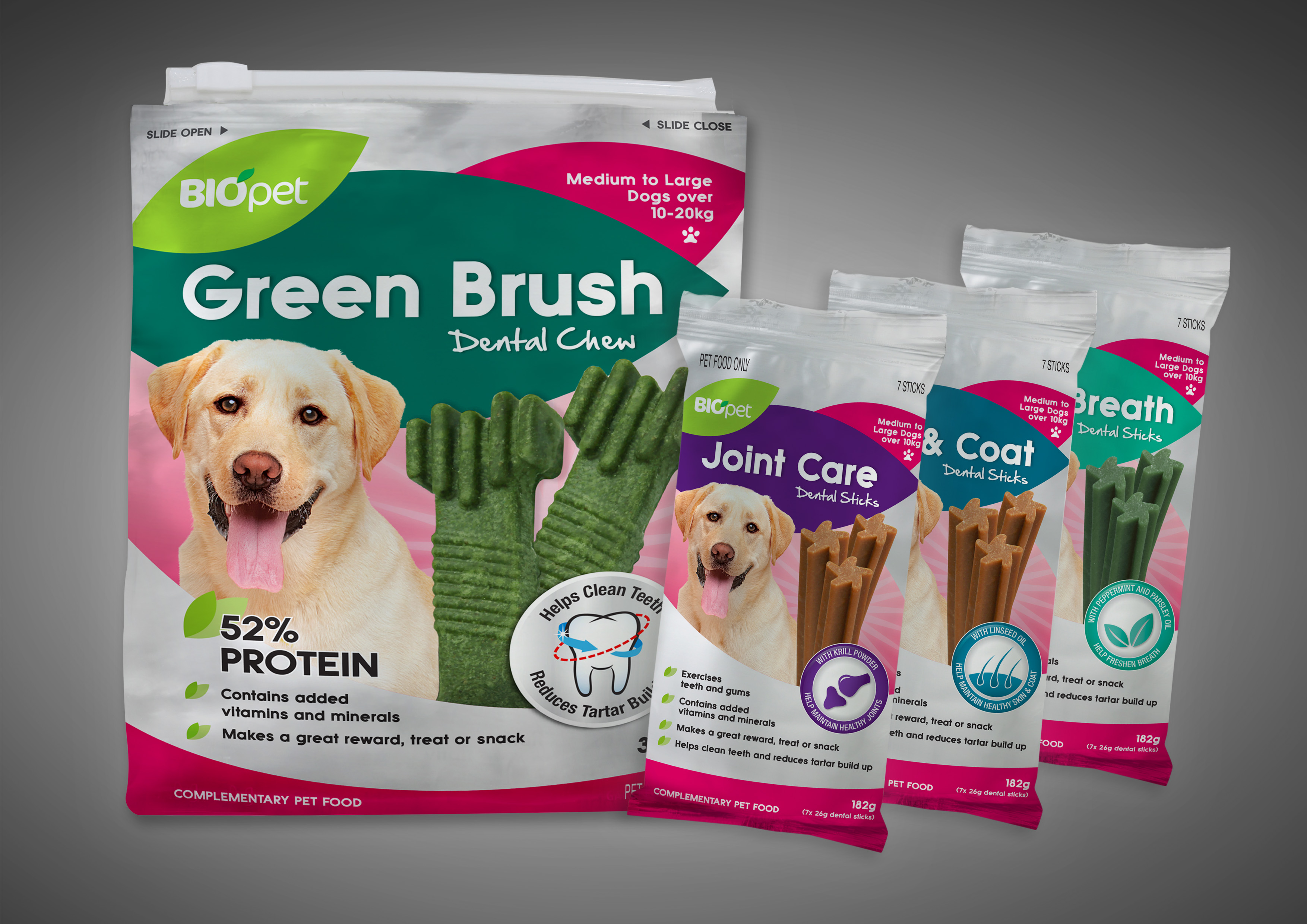
We’ll also ensure that the product packaging is consistent with current branding guidelines. If a client is after a new look for a brand, we’re more than happy to help you develop this, too.
With package design, we find that much more goes into the package than just the product!
See more

