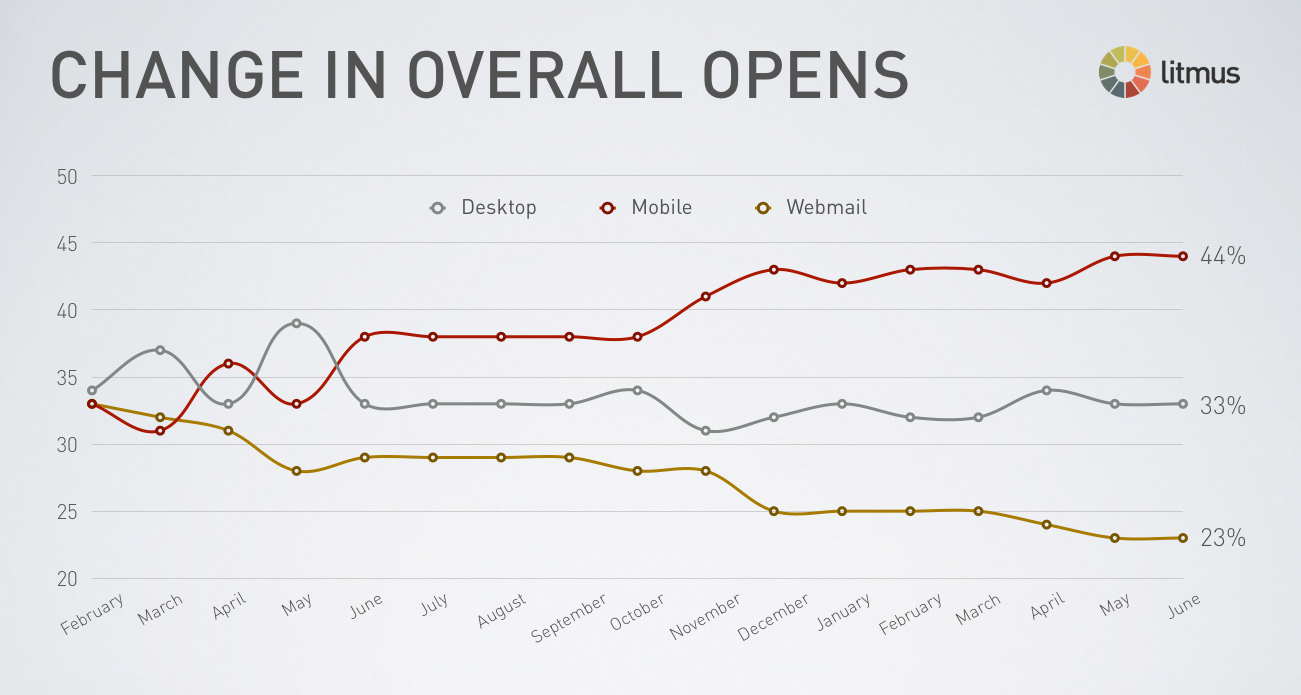
Do you ever check your emails on your phone? Yup – I thought so. Me too. According to a recent Litmus study, 44% per cent of emails are now opened on a mobile device.
 Recently on these pages we discussed the advantages of responsive websites. Responsive websites keep our businesses connected to an increasingly mobile audience. As with websites, poor experience with an email or e-newsletter can keep potential customers at arm’s length.
An email that presents as ridiculously small on a tablet or phone, and which needs to be pinched and zoomed and slid around is far from the ideal reading experience. Users find it generally more trouble than it’s worth.
We also know that while we may not always make time to read marketing emails at home or work, we might if we’ve got five minutes to kill while waiting for a bus or an appointment. A responsive email will make the most of these ‘in between’ moments.
What is responsive email design?
At the core of responsive design for email is a flexible structure which allows an email to be presented in the most user-friendly manner for the device on which it is read. Clear, easy reading and calls to action can be achieved in place of an email where the font is small, difficult to interact with and fits poorly to the page.
Can I tell how my customers are accessing our emails?
 It’s true that some client bases may be more or less mobile than others, and it’s worth getting insight into what category your clients fall into. This will allow you to gauge the value of a shift to responsive email design for your email marketing campaigns.
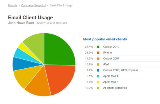
Depending on which software you use to manage your email campaigns, you may be able to access a range of statistics about your subscribers’ behaviours – including open rates, links clicked and on what devices or client the email is read on.
Advantages of Responsive Email
- Full interactivity of features such as links
- Design re-arranges to give the best experience for that device.
- Awkward horizontal scrolling is replaced with the more natural vertical scrolling on phones.
- Lengthy content can be cut down to create an easier reading experience.
- Buttons that are easy to click with a mouse can be enlarged so they’re just as easy to access on touch devices.
Will responsive email work on any device?
Responsive email is very new technology that is supported by many popular devices (such as iPhone and new android devices); with more devices supporting the technology every day. However, some older devices simply don’t support responsive emails and in a fair amount of cases they will display the desktop version.
It’s difficult to achieve an optimum result on every single device, as they will vary in their what they are able to render from your email. The factors that affect this ability include device type, email software program (or email client), the operating system the phone uses and the service provider. But despite all this, it is possible to achieve an attractive, easy to read and functional design for most devices.
Tips for optimising content for mobiles
- Think short and snappy for subject lines. Some phones will only display as little as 15 characters. If a longer subject line is required, try to put the most compelling or important content first.
- Keep content concise. Repetition or excessive verbiage may be tolerable on a big desktop monitor, but can provoke scrolling fatigue on a device with a small screen.
- Simplify design – don’t overcomplicate; less is more for mobile-friendly design.
- Put call to actions in a prominent position.
- Keep images simple. Complicated images may work on the desktop but scaled down on a smaller screen they won’t work.
Any questions about responsive email and your business marketing? Give us a call 02 8850 2215.
