We’ve gone and done the impossible. We’ve made business intelligence software look sexy! Take a look at our recent work with Inside Info.
BRAND REFRESH: INSIDE INFO
Life can be a mystery. Try as we might, there are some things that seem to have been created on purpose just to puzzle us. Like why is there an ‘eject’ button on a remote control when you still have to get-up and remove the disc from the player? Are clothes dryers, in fact, portals to other pockets of the universe, given the ‘Missing Sock’ phenomenon? And did anyone really understand what was going on when they first saw Inception?
For many users, choosing the right Business Intelligence (BI) software can also seem like another riddle waiting to be solved. We seek answers on how to grow our business, only to find more and more questions arise instead when trying to find the right tools with which to do it. In an industry that seems to celebrate unnecessary complexity, what customers really need is BI software that’s smart, simple and in turn, helps transform the way people work.
Inside Info is one such self-service BI provider that delivers that solution. Their software is developed with the user in mind: it’s easy to use and intuitive: offering insights into business processes in a smart, simple way.
They have the right product…so in a large market filled with players big and small all shouting different messages to potential customers, how do you make your company’s voice heard?
STAND OUT FROM THE REST
The challenge for Inside Info was how to express their point of difference through their brand and marketing. Their existing branding had served them well from when the company began 12 years ago: where the main selling points for the BI industry were on powerful software tools and technical expertise.
Nowadays, just about every BI software provider will rattle-off these benefits to potential customers. They are no longer a point of difference within the industry. So it was time for a brand refresh for Inside Info: to shift from techy-looking creative to something that communicates real benefits and resonates more on a human level.
BRING THE BRAND TO LIFE
Orion Creative worked with Inside Info to give the brand a more vibrant personality. To connect more with Inside Info’s existing clients and prospects by communicating how simple to use, intuitive and powerful the software is.
Orion’s Graphic Design, Web Design and Development services were utilised to make this happen.
Graphic design
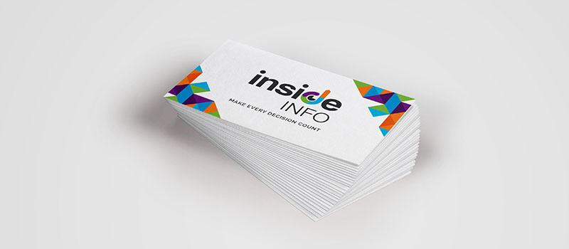
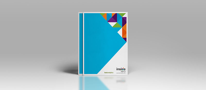
As part of the brand refresh, Orion created a new corporate identity for Inside Info, developing a new logo, contemporary typeface and bright colour palette. The creative was rolled-out across all of Inside Info’s marketing materials for a consistent look and feel that visually packed a punch.

Logo
The new logo uses bright colours for a fresh, modern, accessible look and feel, while the variance in colours symbolises a broad range and scale of product features. The logo treatment also includes a pie chart and bar graph to represent Inside Info’s core business function. The upward direction of the bar graph suggests business growth as a result of using Inside Info’s products, and realising your business’ full potential. The overall treatment culminates to a conceptual eye, denoting Inside Info’s products will provide its end-users with greater insights into their business.
Marketing materials
Orion created a suite of marketing materials incorporating the new creative. This included brochures, business cards, PowerPoint templates, and social media banners.

Web design
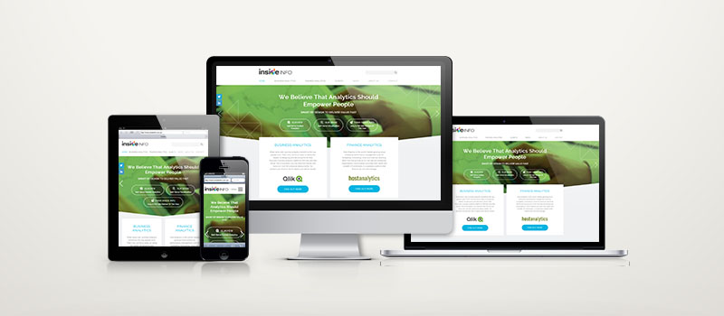
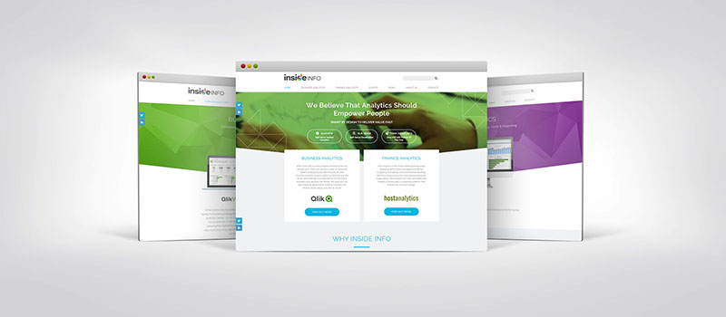
Orion designed a new website for Inside Info, utilising the brand refresh elements such as the newly designed logo, colour palette and typeface. The site uses plenty of imagery (optimised to load quickly) and reduced copy to instantly engage the user when they visit the site.

The navigation has been streamlined and each page is laid-out with clear and consistent use of colour to break-up large amounts of information and make it easier for the user to read.
Dynamic, colourful banners with textured, geometric backgrounds feature on the home page to promptly communicate the product benefits to the user. Visual cues like simple illustrated icons were also utilised to make navigation easier.
Web development
Users are increasingly viewing websites on multiple devices which has dramatically changed the way content is now consumed. Optimising websites to ensure the best user experience (known as UX) for multiple devices is now more important than ever.
Optimised UX
Collaborating with the Inside Info team, Orion established what content was most important to the user and what needed to be communicated when visiting the website. Orion worked closely with Inside Info to develop an optimised user experience (UX) that best suited these requirements.
The site is dynamic, responsive and built with powerful, scalable and user-friendly Drupal Content Management System (CMS) software, so content can be easily updated and self-managed by the Inside Info team whenever required.

Mobile-friendly
With more people using mobile devices for online activity, the theme of the site was developed using the best-practice ‘mobile-first’ approach. This ensures that when web content is displayed on smaller devices (where content is displayed vertically), it has a clear hierarchy top to bottom to make it easy for users to navigate (scroll) on mobile devices.
For larger devices such as desktops, elements are then gradually added or modified so that relevant content can fit within the available screen space. This ensures that no matter what device is used, the look and feel of the site always provides the best viewing experience.
Improved SEO
The navigation includes subtle hover animations to give the site a more polished, professional look, while images within the theme are also optimised to reduce their file size when loading, which improves Search Engine Optimisation (SEO) rankings.
The website also included a new URL, so all old URLs were mapped and redirected to the new site. The old URLs are kept live to preserve any current SEO rankings.
Streamlined forms
There are a number of resources available on the site for users to access, including fact sheets and access to product trials. For any element that can be downloaded by the user, this can result in complicated forms in the back-end development which can easily get lost or forgotten within the CMS. To streamline this process, a dynamic form was developed for downloading products so they could all be easily accessed and managed from one place in the CMS. An easy-to-use resource area was also developed so that the Inside Info team could manage various files and videos and control who has access to these resources.
THE RESULTS ARE IN
The new Inside Info website launched 17 March 2015 and has been live for a month. Over this short period, the site has returned the following results compared to the same period in 2014:
- Number of returning visitors has increased by 53%
- Average session duration has increased by 46%
- Bounce rate has reduced by 17%
Here’s what Sonia Johnson, Head of Marketing for Inside Info had to say about working with Orion Creative:
“I wanted to say a big thank you to the team for everyone’s efforts on our new website and new brand identity. I know a lot of hours have gone into this by a lot of people, but it certainly shows.
The new branding really hits the mark and the website looks amazing and is now more functional making it easy for me to keep content fresh across the website and social media. I really appreciate the fresh ideas … and the way everyone made the whole process easy, it’s a credit to your team.”
Clear, colourful creative that communicates real benefits simply, smartly…It’s no mystery, really.
Visit the new Inside Info website here.
Could your brand benefit from some TLC? Contact Orion Creative here.
If you’d like to keep up-to-date with our latest work and tips on social media trends, marketing and more, follow us on Facebook, Twitter or LinkedIn.