The time is now
For the better part of the last two years, many consumers have ditched their regular trips to the mall and have instead opted to do their shopping online. With more and more people now taking the virtual route to get what they need, one could argue there’s never been a more important time than the present day for businesses to have an up-to-date, engaging, fully-functioning website.
While a good website doesn’t automatically ‘make’ a business, an unprofessional, poorly-designed website with slow load times can certainly break one. And you wouldn’t believe how often we see businesses with websites experiencing these exact issues asking where it all went wrong. Many of these businesses had their website built years prior and haven’t touched them since. What was once a good website has now turned into one riddled with problems; problems that have continued to manifest due to lack of care and intervention.
Take a hard lesson from those businesses who’ve experienced it themselves: just because you’re not seeing the issues your customers and website visitors are having, doesn’t mean those issues aren’t having a negative effect. In this article, we’ll be looking at the three most common reasons why your bad website is killing your brand.
1. Your users think your products/services are low quality
I live near a Thai restaurant that’s, let’s say, a bit run down. It’s only a two-minute walk from my apartment and I’ve lived within one block of this restaurant for nearly two years. Despite it being very convenient from a time and access standpoint, I’ve only been to that restaurant once.
Why? Is it because their food was made from low quality products or didn’t taste good? Were their prices off? Did they have bad customer service? None of the above. The food was tasty, their prices were acceptable and their customer service was fine. I just never really had any inclination of returning because their presentation was terrible.
It’s the kind of restaurant that has one of those dodgy-looking LED business signs in their front window with half the letters blacked out. Their parking lot had dumpsters surrounded by hungry cats. Their furniture looked like it belonged in a high school cafeteria.
Had I eaten there more often, it’s likely I would’ve tried more of their dishes and enjoyed them. Unfortunately, I projected some of their underwhelming attributes on the entirety of the restaurant and to this day I choose to drive fifteen minutes to another Thai restaurant two suburbs over that I know and trust.
But enough of my love of Thai food and back to the point – do you see how potential customers could do this with your website?

ask yourself these key questions
Does your website look like a template?
If your website was designed using a common template or features generic stock photography that many other businesses are also using for their websites, customers may feel like they’ll miss the personal touch working with you.
Does your website look unprofessional?
If someone’s first impression of your website is that it looks unprofessional, they’ll likely project that same feeling onto your products and services.
Does your website feel cheap?
If you didn’t spend the money investing in a good website, customers may assume you don’t spend the money on creating good products/services.
Does your website work on mobile?
In 2020, there were 4.28 billion unique mobile internet users, meaning over 90 per cent of the global internet population use a mobile device to browse the web. If your website still isn’t optimised to load correctly on mobile, your potential customers are going to find another business that isn’t stuck in 1999.
2. Your customers are getting annoyed
As we mentioned a bit earlier, another way your website is killing your brand is when certain components on your site don’t function properly.
Whether it be slow load times, forms not working or things not appearing where they’re meant to, the majority of people, firstly, won’t let you know they’ve experienced a problem, and secondly, won’t stick around in hope the problem will fix itself.
Technology over time has made people very impatient, and if they aren’t able to instantly get what they want from a click of a button, they’re going to look elsewhere. So just how long are people willing to wait for your website to get its act together?
“62 percent of users will only wait five seconds (or less) for a web page to completely load. That’s an unforgiving statistic.”
imperva.com
Imagine you’re on a website looking to contact a business to enquire about one of their products, but their contact form doesn’t work. Would you try using another browser to see if that solves the problem? Do you even have multiple browsers on your computer? Would you be bothered reaching out to the business to let them know their form isn’t working? Probably not. You’d go and find another site that actually works.
Just because most things on your website are working fine doesn’t mean that everything’s fine. Achieving big success through your website comes from firstly getting all the small pieces of the puzzle in order and creating a user-friendly online environment. When one small piece of the puzzle is missing (or broken) – whether that be load times, broken forms or confusing messaging – it can be detrimental to your entire website.
3. Your customers are confused by your website
Ignoring the design and technical aspects of your website for one minute, another huge problem for your brand is a confusing website. This problem is usually caused by your messaging and content not being in alignment.
Ask yourself these three questions:
- Are your product/services up to date?
- Are there products/services advertised on your website that you no longer sell?
- Do all of your products/services have adequate information for your customers?
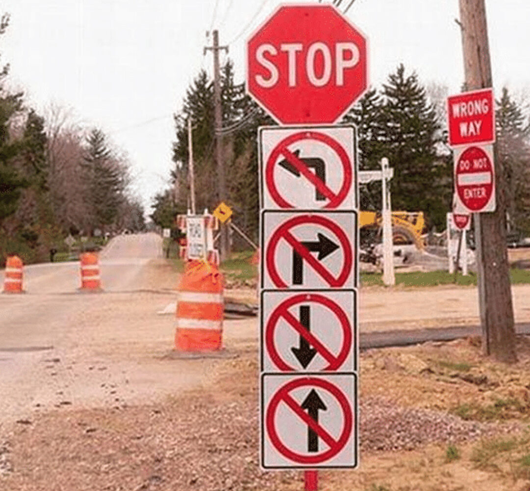
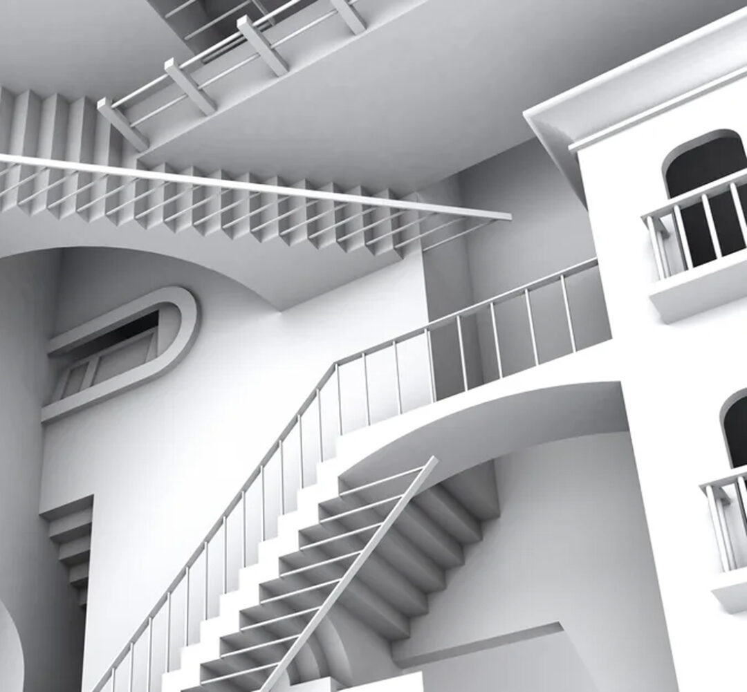
From a content perspective, an outdated website can be very confusing for your customers. At Orion, we see a lot of businesses with websites that represent where the company was five years ago – not where they are today – wondering why their sales are dropping and why customers are disconnected with their brand.
Ensuring your content is up-to-date, accurate and appearing in the right places will help your visitors and potential customers understand your brand, what you represent and what you have to offer.
What now?
Your website has five seconds to make a good impression – and first impressions are everything. Ensuring that your website has a high-quality design, runs smoothly and has consistent messaging will not only make a great first impression on potential customers, it will strengthen your brand beyond belief.
But this doesn’t come easily. It takes vision, time, money and effort. You have to truly believe that all the little things that make up your website matter. You have to take pride in your product and truly believe that an underwhelming, underperforming website is not acceptable, and that customers will have a negative perception of your brand because of it.
But is investing your time, money and effort worth it? You bet it is. Your website is essentially your hardest working employee, selling your products/services and representing your brand 24/7.
Trust orion creative
This is where Orion Creative comes in. If you need to update your online presence with a new, modern website, we’ll be with you every step of the way from consultation through to implementation.
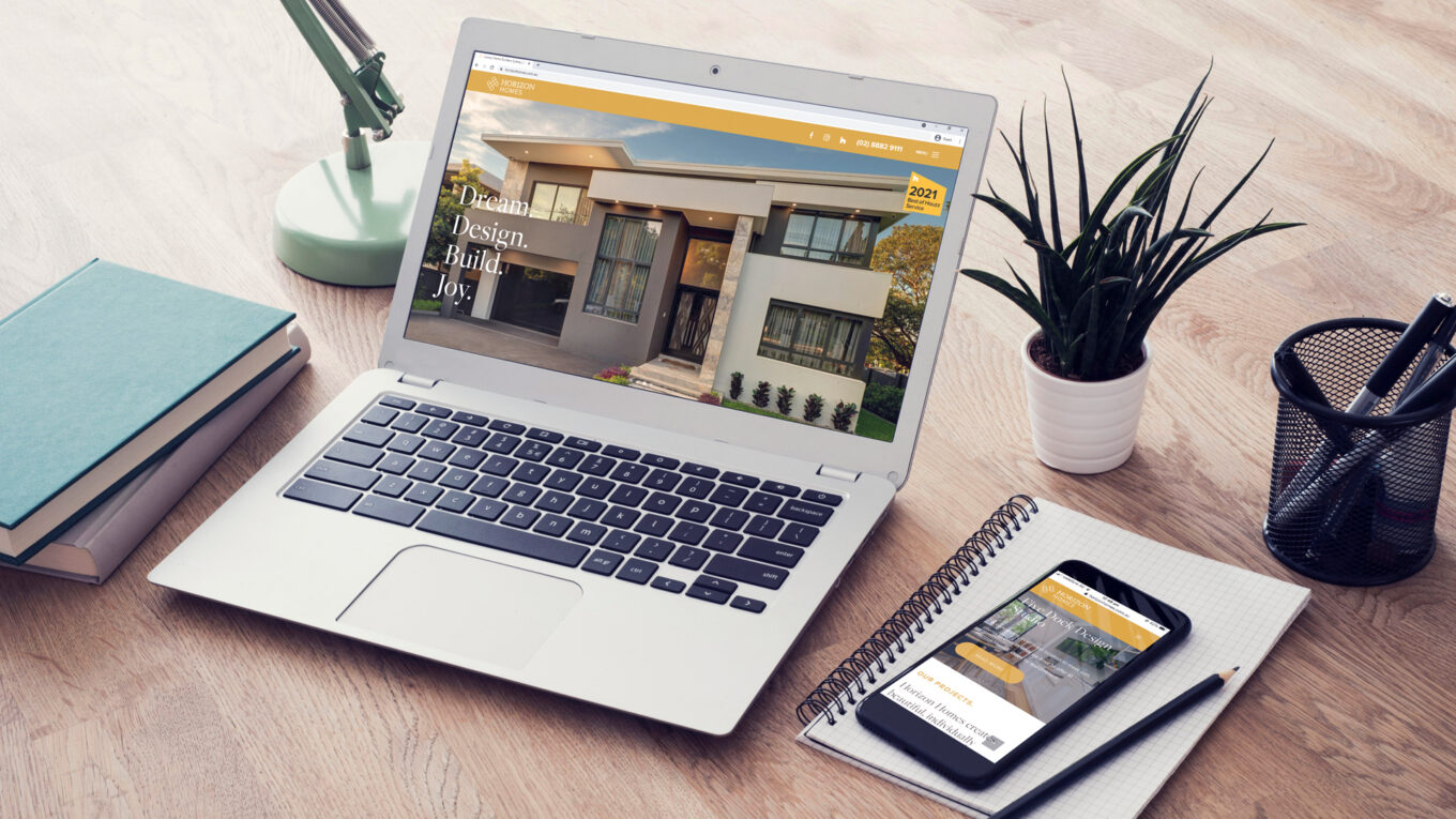
Take, for example, the website we built for custom home building company Horizon Homes. Horizon Homes had a number of qualms with their old website that they wanted their new, Orion-built website to resolve, encapsulating everything from imagery, layout, and colour choices to written content and website navigation.
Their old home page had next to no content, which was a big problem for both Search Engine Optimisation (SEO) and user experience. Our new home page delivered much more, in terms of valuable information, their projects and service offerings. The old site also featured a single black and white background image on every page, which wasn’t very welcoming and didn’t portray the product or dream of home ownership in the best light.
Take their website feel more inviting and homely, we designed the home page so when potential customers visit it, the first thing they are greeted with is a full screen of rotating images of some of Horizon Homes’ most picturesque builds. After all, building beautiful homes is their bread and butter, and we wanted to put that fact on full display.
A new look to floor their audience
Another of our happy clients was leading tile provider Glennon Tiles, for whom we built vibrant, eye-catching new website.
Their new website needed to complement the direction of the modernised brand with the new logo, colours and icon library. The team worked together to rejuvenate the client’s outdated website which looked tired, had multiple page-loading time issues, wasn’t mobile-optimised, and was not overly intuitive in terms of page layouts and content flow. The result is a brand new website that is now far easier for the client to feature their collections, and for site users to get to what they’re looking for far quicker.

We do all this, all the time
These are just two of the hundreds of first-class websites we’ve built over our 25 years in business. No job is too big or small, and our experienced team of web developers, designers and content producers will always offer a fresh perspective in creating the perfect website to represent your brand and suit your specific business needs.
To ease your mind and discover the true potential of your website, get in touch with us today for an obligation-free chat. We’ll get you heading in the right direction, and more importantly, we can guarantee our contact form is working just fine.
but don’t just take it from us
“An outstanding creative agency with a very talented roster of designers and developers. Responsive, consistent and high-quality output are the words that come to mind when thinking about my experience with Orion over the past 5+ years.”
Karo Esmaili, Program Director, APJ
citrix
