More than just an image
Your logo is one of the most important branding elements of your business, saying so much about you without actually saying anything at all.
It’s a reflection of who you are, what you do and the quality that people can expect from your product or services. However, while logos are often one of the first things people create when launching their business, many fail to update or refresh their logo as their business grows and develops.
A logo that once looked fresh and caught the eye may have turned stale and could no longer be an accurate reflection of your business – and is that really the first impression you want to risk your customers having of you?
Some businesses view their logo as their baby, refusing to even harbour the thought of changing it because it’s perfect in every way. But for something that plays such a big role in attracting customers and the overall success of your business, you may very well be shooting yourself in the foot with your stubbornness in resisting change.
In this article, we’ll be discussing the importance of having an effective logo that accurately represents your business, and why and when you should consider updating yours.
What’s in a logo?
The right logo can convey feelings of trust, pride and excellence from a simple glance without the need for pages of explanations. It can also establish a sense of connection between a brand and its consumers, customers and followers.
While this is all well and good, take note: these benefits only apply to the right logo. On the flipside, having the wrong logo can be truly detrimental to your business and the results it achieves.
Aside from simply looking good and making an excellent first impression, the three biggest benefits of a strong brand logo are:
It reflects your brand identity
A strong brand logo gives people a sense of what you do, who you do it for and why you do it. A single image can’t say it all, but in subtle and subconscious ways, it can say a lot. A good example of this is Nike’s ‘swoosh’ – it creates the impression of speed, motion and athleticism. While many people think it’s just a tick, it has a deeper meaning; it represents the wings of Nike, the Greek goddess that symbolised victory.
It builds trust with customers
With anything, a strong presentation leads to a strong perception, and a simple, polished logo will establish a sense of trust between consumers and your business, legitimising your organisation within their mind. However, a poorly crafted logo can create scepticism and distrust of your business – if your logo isn’t impressive, why should a potential customer believe your products or services are?
It helps you stand out from the crowd
A unique, recognisable logo is a great way to stand out and seed your brand in the brains of potential customers, as the more people who know and remember your logo, the more established your brand becomes. Think of all the truly iconic logos in the world today – McDonalds, Coca-Cola, Apple, Nike, BMW – and how ingrained those brands are in our culture. Boasting logos that are almost instantly recognisable, they all have a huge marketing advantage over their competition.

What are the signs that it’s time for a logo redesign?
Now you know the importance of having a strong logo, it’s time to discuss the signs that it might be time to consider a logo redesign. As previously mentioned, it’s often hard for business owners to change their logo for the first time because they consider their logo a part of who they are and what they represent.
But it’s important to consider this topic with a completely unbiased view, otherwise you’ll be stuck with the same outdated logo for far too long, and by then people will have well and truly noticed and have formed an opinion that your business isn’t keeping up with the times. Here a few key indicators that your logo needs a revival.
It makes people think they’ve travelled back in time
Think about visiting a website designed in the early 2000’s or still wearing that shirt that you bought in the 90’s – it’s not hard to tell that they’re dated. While some things that are old can be considered ‘vintage,’ logos are not one of them. Trends and tastes naturally change over time, and that can affect people’s perception of your logo.
You’ve simply grown out of it
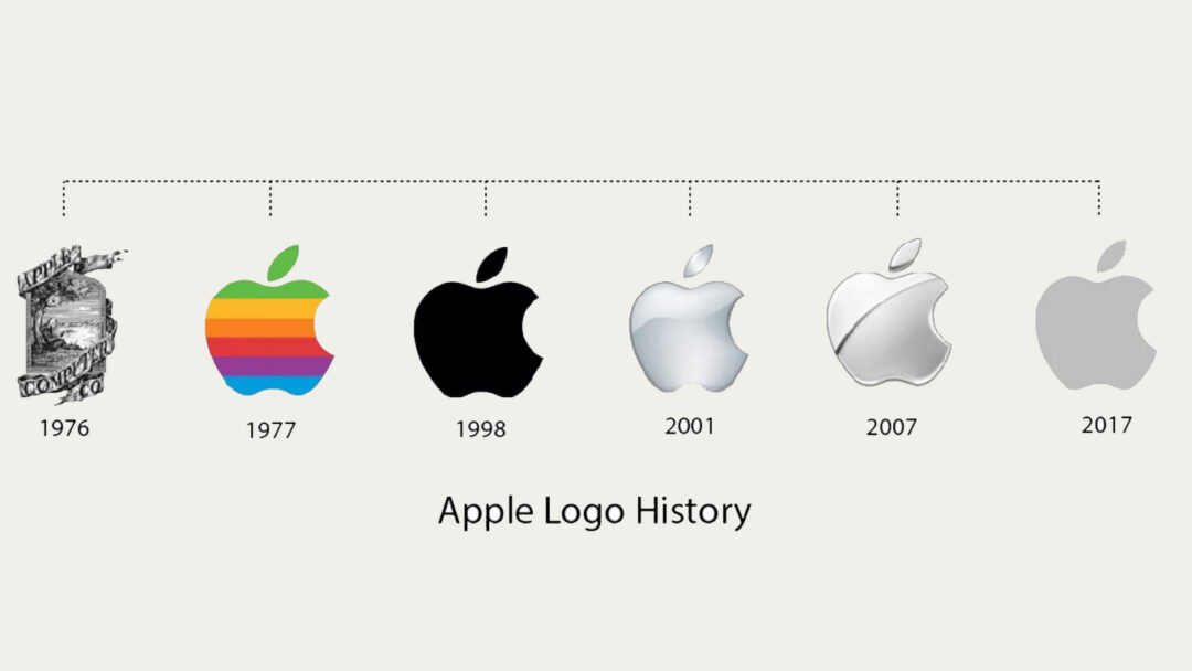
Just as children outgrow their clothes, business can also outgrow their logos. It doesn’t mean the clothes a child has outgrown are useless, it’s just they’ve moved onto bigger and better things. Whether you’ve added new products or services, changed your tagline or stepped into a new industry, your company logo should grow as you do.
You’ve since expanded your audience
As your business expands, it’s likely so too will your services and the audiences that you’re targeting. If your logo is a bit one-dimensional and doesn’t depict the current state of your business and everything it offers, a logo redesign can help you attract your new target audiences and present a more accurate reflection of who you are and what you do.
People find it hard to understand it
If people are confused about what your logo represents, chances are that it doesn’t make a whole lot of sense or it’s not appealing to your target audience. An effective logo should have a clear concept, otherwise it risks creating an inaccurate representation of your business, which will result in people developing incorrect perceptions of your company. The last thing you want is people associating your poor choice of logo with a poorly run business.
It doesn’t meet the standard of your industry
Being creative with your logo is great. However, if the end result is not up to scratch from the standards that have been set by your competitors within your industry, people will be hesitant to do business with you. Aspects that can make people think this way include special effects, too many colours, drop shadows or a poor choice of font. For a professional looking logo, you need professional graphic designers who know what they’re doing.
Take a look at some of our latest logo Redesigns
Over the years, our talented team of graphic designers have redesigned hundreds of logos for brands looking for a change. Some redesigns were minor with the brief requiring us to stay close to the existing brand, while others allowed for our creativity to run free and give their logo a complete overhaul.
Here are a couple before and after images of our latest redesigns which resulted in extremely satisfied clients and far more polished brands.
Wisemans Ferry Realty
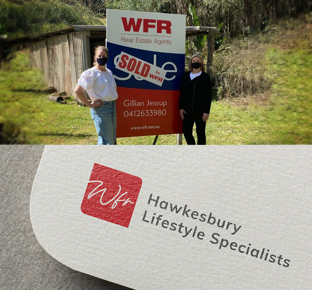
Established over 10 years ago and recently acquired by new owners Rhys and Amanda Coles, the couple came to Orion wanting to put their own stamp on the business by refreshing and modernising the Wisemans Ferry Realty brand.
After a lengthy strategy planning session where we picked their brains on how they wanted to truly make their newly-acquired business ‘theirs,’ our graphic designers got to work and delivered WFR a brand new eye-catching logo, as well as reinvigorated sales boards, business cards, email signatures and letterheads.
The Citrus Factory
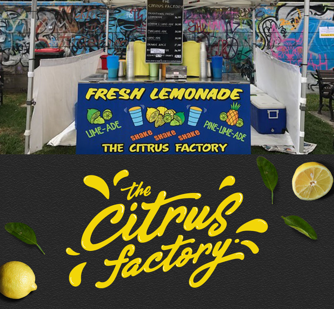
Dedicated to producing 100% natural lemonade, The Citrus Factory have been quenching festival-goers thirsts since 2003 and were well and truly ready to take their classic lemonade stall to the next level with fresh new branding.
Our graphic designers experimented with fonts and combinations of custom lettering and design elements, and landed on a design with fun, cursive lettering with strategically placed splashes of vibrant yellow that perfectly conveys their business.
Glennon Tiles
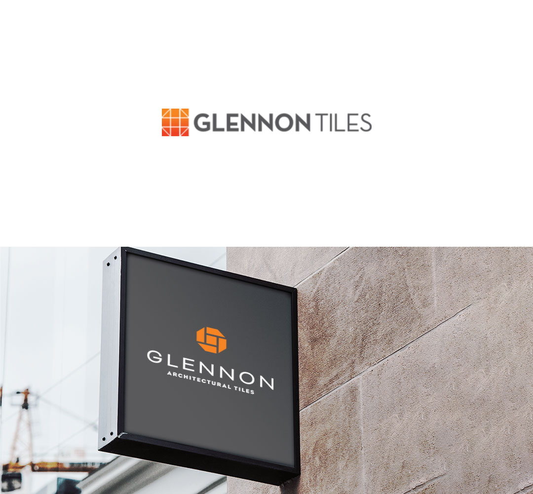
Glennon Tiles didn’t want to completely depart from their existing logo, and wanted to be able to look at the old logo and the new one and see an evolution of their brand. Our design time reinterpreted the square visual icon and transformed it into a simple form that represented tile forms which stylistically form the letter ‘G’.
We simplified the colours from a gradient effect into a minimal one colour application. The font weight was also thinner and more uniform, with the end result a refreshingly modern and memorable new logo, which the client loved.
Horizon Homes
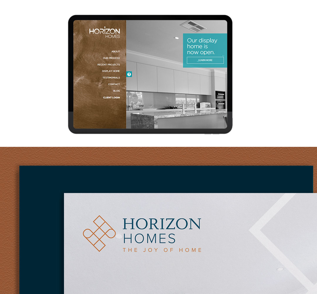
Horizon Homes felt their old logo wasn’t unique enough to demand attention; something that didn’t sit right with them considering their business is centered around developing some of the most jaw-dropping, unique custom builds in the country.
Our designers experimented with a number of different options and ended up presenting the client with a logo made up of obscure shapes that form the letter ‘H’, symbolising their ability as a custom home builder to piece together multiple different construction aspects to build the perfect homes.
Trans-Ax Health Care
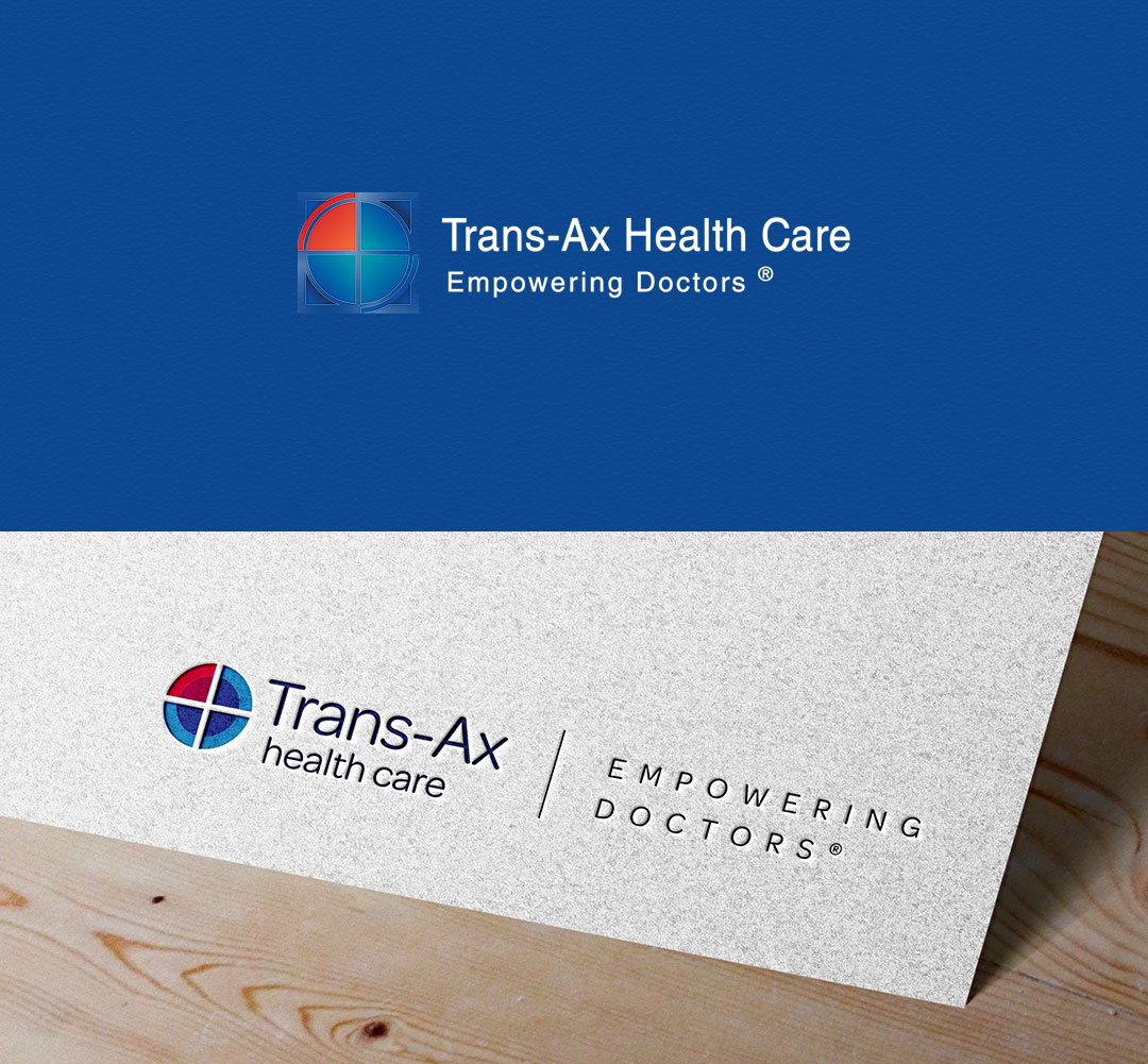
Trans-Ax Health Care wanted a fresh new look to help attract more doctors and patients to their growing number of medical centres across Australia.
Our design team got to work and presented Trans-Ax with a modernised take on their existing logo. The client felt this modernised concept effectively updated their brand whilst also honouring their legacy and still being recognisably Trans-Ax.
Do you think it’s time to refresh your logo?
Think of any iconic brand – what do they each have in common? A business logo that’s instantly recognisable, sometimes without the need to even mention the company name. If you want to reach your full potential as a business, you’ll need a likeable, versatile and durable design that can stand the test of time, whether you’re a retail outlet, a small business, or a large corporation.
Your logo acts as a reflection of your company and what you stand for. By getting to know you and your values, Orion Creative’s team of expert graphic designers will provide you with a design that’s truly personal and meaningful to you and your team, and even more importantly, to your customers and prospects.
If you feel like your business is overdue for a modern logo redesign that accurately depicts who you are in 2022, contact us today to see how we can help.